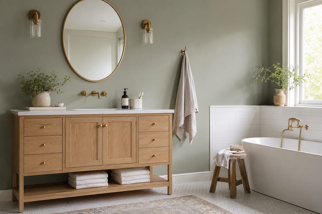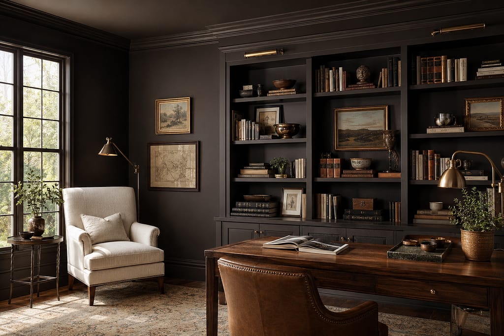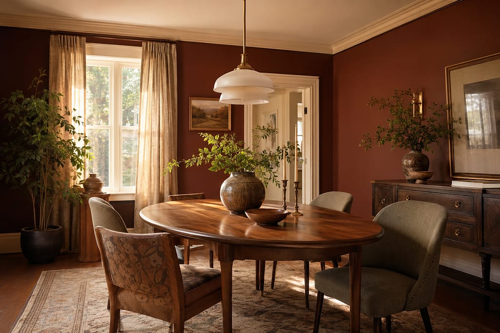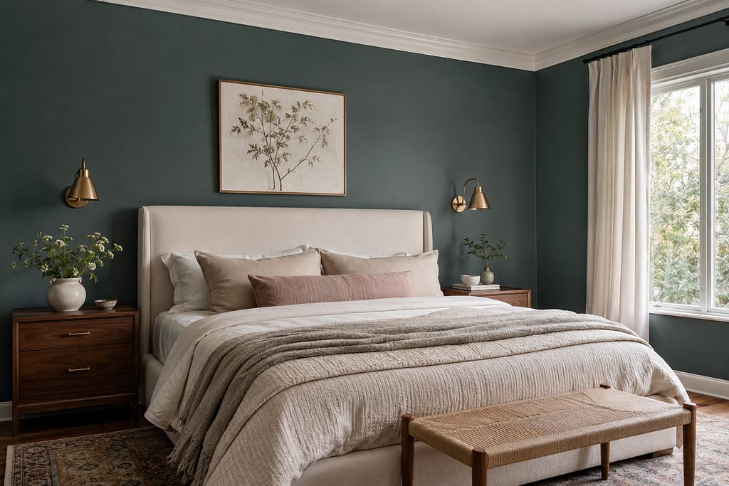


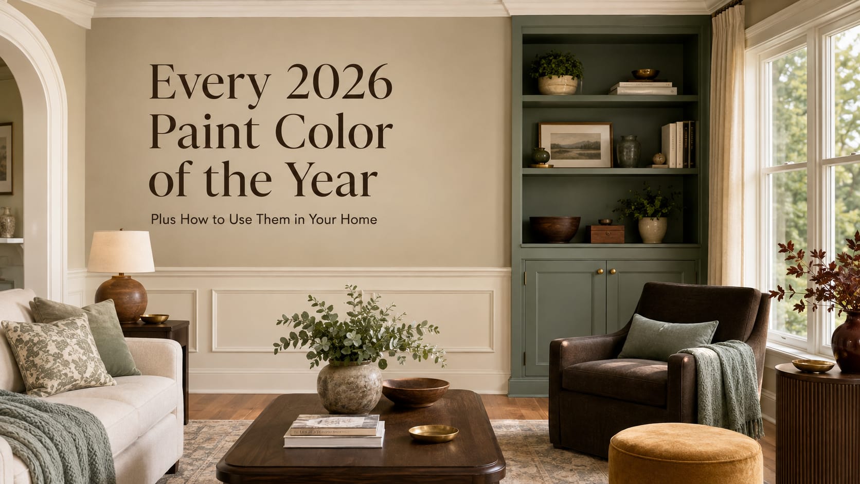
If the 2026 Colors of the Year have one message, it is this: our homes are getting warmer, richer and more personal.
Cool gray is continuing to fade into the background. In its place, paint companies are embracing earthy khakis, creamy ivory, smoky green, deep brown, burgundy, plum and heritage-inspired blue. These colors feel connected to nature, craftsmanship and the idea of creating a home that is comfortable rather than simply trendy.
Several companies even selected the same color families, suggesting that warm neutrals, natural greens and rich, cocooning shades will influence home design well beyond 2026.
Here is a closer look at the major 2026 Paint Colors of the Year, along with practical ways to use each one in your home.
1. Sherwin-Williams: Universal Khaki SW 6150
Sherwin-Williams selected Universal Khaki SW 6150, describing it as an essential neutral that balances livability with longevity.
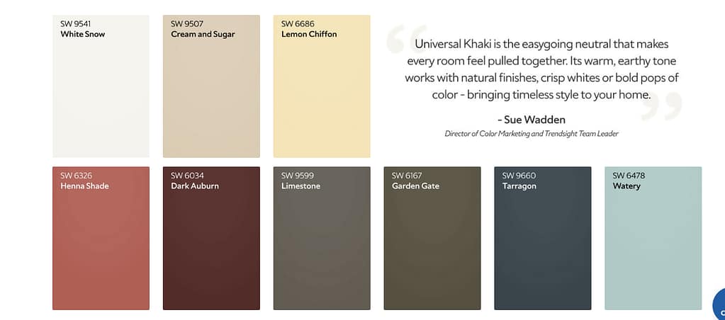
Universal Khaki is a warm, earthy midtone that falls somewhere between beige, taupe and soft brown. It feels more grounded than a light cream but is still neutral enough to use throughout an entire home.
How to use Universal Khaki
This is one of the easiest 2026 colors to use on a large scale.
- Paint living room, hallway or open-concept walls for a warm, connected look.
- Use it in a bedroom with ivory bedding, natural linen and medium-toned wood.
- Try it on kitchen cabinetry with cream countertops and aged brass hardware.
- Pair it with terracotta, muted green, chocolate brown or warm white.
- Use it on exterior siding with creamy white trim and dark bronze accents.
Universal Khaki is an especially practical choice for homeowners preparing to sell. It adds warmth and character without being so bold that buyers have difficulty imagining their own furniture in the space.
HGTV Home by Sherwin-Williams also chose Universal Khaki as the anchor of its 2026 Honest Essentials Color Collection. This is the first time Sherwin-Williams and HGTV Home by Sherwin-Williams have united around the same Color of the Year.
2. Benjamin Moore: Silhouette AF-655
Benjamin Moore’s 2026 Color of the Year is Silhouette AF-655, a sophisticated mixture of espresso brown, burnt umber and subtle charcoal.
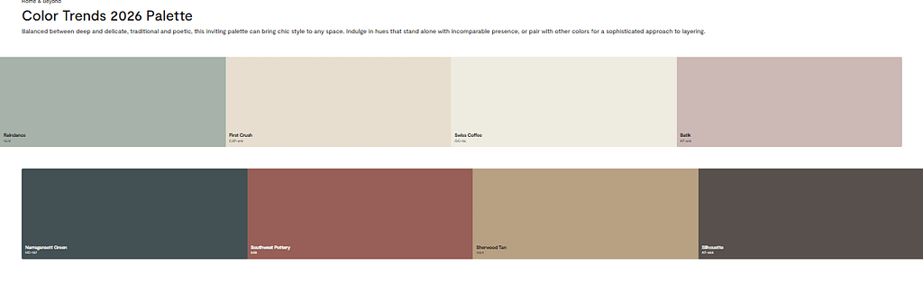
Silhouette is dark, dramatic and tailored. Unlike a flat black or cool charcoal, it has enough brown in it to feel warm and inviting.
How to use Silhouette
Silhouette works beautifully when you want a room to feel intimate and refined.
- Color-drench a dining room, library or home office by painting the walls, trim and doors in the same shade.
- Use it on a fireplace wall to create a strong architectural focal point.
- Paint a bathroom vanity or kitchen island for a smaller commitment.
- Pair it with warm white, blush, camel, muted blue or aged brass.
- Use it behind artwork, mirrors or light-colored furniture to create contrast.
In rooms with limited natural light, Silhouette will appear deeper and moodier. In a sunlit room, its brown and charcoal undertones become easier to see. Always test it at different times of day before painting an entire room.
3. Behr: Hidden Gem N430-6A
Behr named Hidden Gem N430-6A its 2026 Color of the Year. The company describes it as a smoky jade that combines blue and green.
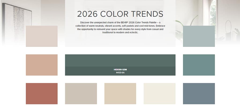
Hidden Gem is a deep, sophisticated alternative to the lighter sage greens that have dominated interiors in recent years. It feels calming and natural, but its richer saturation gives it more personality.
How to use Hidden Gem
- Use it in a bedroom with crisp white or ivory bedding.
- Paint lower kitchen cabinets and keep upper cabinets light.
- Create an accent wall behind a bed, sofa or dining table.
- Use it in a powder room with brass fixtures and a patterned floor.
- Paint an exterior front door for an elegant, nature-inspired entrance.
Hidden Gem pairs well with creamy whites, natural oak, walnut, cognac leather and muted gold. For a bolder combination, add dusty pink, plum or ochre.
Because blue-green colors can shift considerably under different lighting, test Hidden Gem on more than one wall. It may appear greener in warm artificial light and bluer in cooler daylight.
4. Valspar: Warm Eucalyptus 8004-28F
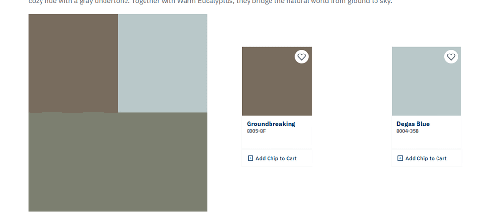
Valspar chose Warm Eucalyptus 8004-28F as its 2026 Color of the Year.
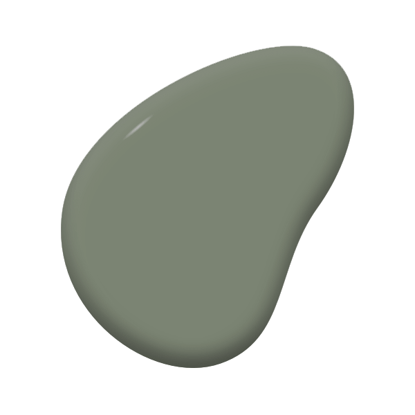
This restorative green has gray and slightly blue undertones, giving it a relaxed, weathered quality. It is softer and less dramatic than Behr’s Hidden Gem, making it easier to use across a larger room.
How to use Warm Eucalyptus
- Paint bedroom walls for a restful retreat.
- Use it in a bathroom with warm white tile and natural wood.
- Try it on a laundry room or mudroom cabinet.
- Add it to a screened porch or sunroom.
- Pair it with oatmeal, soft lavender, weathered wood or creamy white.
Warm Eucalyptus is a good option if you want to introduce color without making a room feel overly decorated. It can function almost like a neutral when surrounded by natural materials.
5. Glidden and PPG: Warm Mahogany PPG1060-7
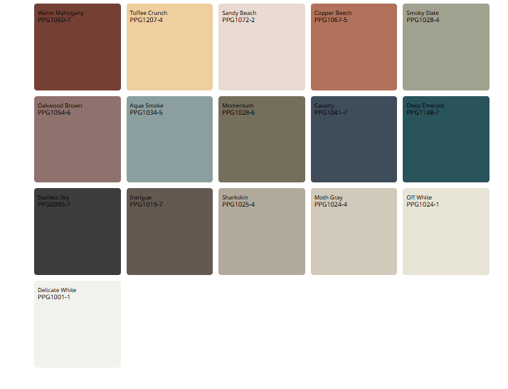
Glidden selected Warm Mahogany, a rich red-brown designed to be bold, grounded and timeless. It is also featured as the central shade in PPG’s 2026 Color and Design Trends.
Warm Mahogany is not a bright, traditional red. It contains brown and earthy undertones that give it the appearance of aged leather, mahogany furniture, dark terracotta and autumn leaves.
How to use Warm Mahogany
- Paint a dining room for a warm, welcoming atmosphere.
- Use it in a reading nook or small home library.
- Try it on a kitchen island with cream perimeter cabinets.
- Paint a mudroom, butler’s pantry or built-in bookcase.
- Add it to a front door or shutters on a neutral exterior.
Warm Mahogany works particularly well with natural stone, creamy white, camel, navy, olive green and dark wood.
In a small room, consider embracing the depth instead of trying to make the room appear larger. Painting the walls, trim and ceiling in related tones can create an intentional, cocoon-like effect.
6. Dutch Boy: Melodious Ivory 313-2DB
Dutch Boy’s 2026 Color of the Year is Melodious Ivory 313-2DB, a soft, creamy neutral inspired by simplicity, authenticity and intentional living.
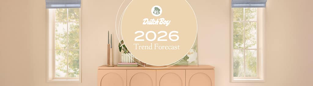
Melodious Ivory has more warmth than a stark white. It creates a comfortable background for vintage pieces, layered fabrics, natural materials and handcrafted decor.
How to use Melodious Ivory
- Use it throughout an open floor plan for a consistent, airy background.
- Paint walls and trim in the same color but use different finishes.
- Pair it with reclaimed wood, woven baskets and handmade pottery.
- Use it in a north-facing room that needs additional visual warmth.
- Combine it with burgundy, olive, ochre, dusty blue or dark brown.
This is another strong option for homeowners who want a neutral that feels updated without making a dramatic design change. It may also help soften a room filled with cool gray flooring or furniture.
Be careful when pairing creamy ivory with very bright white. The contrast can cause the ivory to look more yellow. Compare your trim, countertops and permanent finishes before making a final decision.
7. C2 Paint: Epernay No. 639
C2 Paint selected Epernay No. 639 as its 2026 Color of the Year.
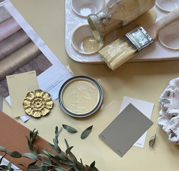
Inspired by sunlit stone, vintage textiles and the French region known for champagne, Epernay is an earthy soft ochre with quiet mineral undertones. It feels historic without looking dated.
How to use Epernay
- Use it in a kitchen with natural wood cabinets and aged brass.
- Paint a living room with plaster, linen and stone accents.
- Try it in an entryway to create a warm first impression.
- Pair it with olive, rust, charcoal, cream or faded blue.
- Use it as an exterior accent on a front door or garden structure.
Epernay is especially well suited to traditional homes, European-inspired interiors and rooms that feature antiques. It can also warm up a modern space when paired with clean lines and minimal furnishings.
8. Graham & Brown: Divine Damson
Graham & Brown’s 2026 Color of the Year is Divine Damson, an opulent shade inspired by ripe damson plums and figs.
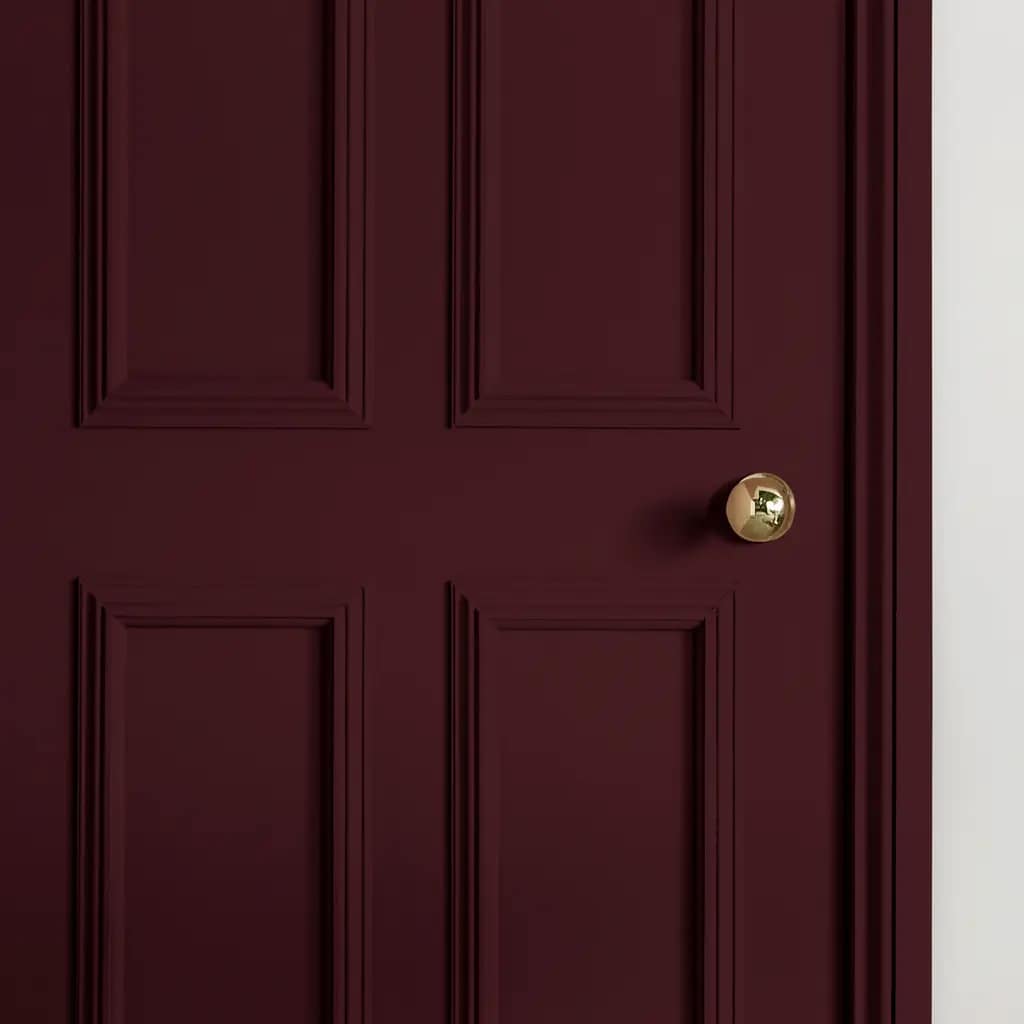
Depending on the light, Divine Damson can reveal notes of plum, mulberry, garnet and deep red. It is one of the most dramatic selections of 2026, but its warm undertones keep it from feeling harsh.
How to use Divine Damson
- Color-drench a dining room or powder room.
- Use it behind a bed with blush, cream or floral fabrics.
- Paint built-in cabinetry or a wet bar.
- Pair it with decorative wallpaper, especially botanical or traditional patterns.
- Introduce it through curtains, shades or painted furniture if an entire room feels too bold.
Divine Damson works beautifully with antique brass, dark wood, soft pink, muted green and warm stone. It is also an excellent backdrop for artwork and collected objects.
9. Dulux: The Rhythm of Blues
Instead of selecting a single shade, Dulux introduced three 2026 Colors of the Year under the theme “The Rhythm of Blues.”
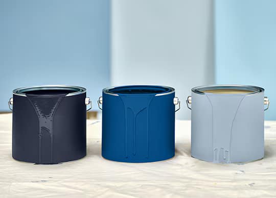
The three indigo-inspired colors are:
- Free Groove – a vibrant, energetic blue
- Mellow Flow – a light, airy blue
- Slow Swing – a deep, meditative blue
Together, they offer different ways to use blue depending on the mood you want to create.
How to use the Dulux blues
Use Mellow Flow in a bedroom, bathroom or home office where you want a light, peaceful atmosphere. Free Groove can add energy to a playroom, creative workspace or painted piece of furniture. Slow Swing is better suited to a sophisticated dining room, media room, cabinetry or dramatic accent wall.
You can also layer the three colors in one space. Use the lightest shade on the walls, the medium blue on cabinetry or furniture and the darkest shade on a door, fireplace or architectural detail.
Dulux products and color names can vary by country, so confirm local availability before planning a project.
10. Krylon: Coffee Bean
For furniture and DIY projects, Krylon selected Coffee Bean as its 2026 Color of the Year.
Coffee Bean is a deep, earthy brown intended to create calm and strengthen the visual connection between interiors and nature. Since Krylon specializes in spray paint, this color is best used for smaller projects rather than walls.
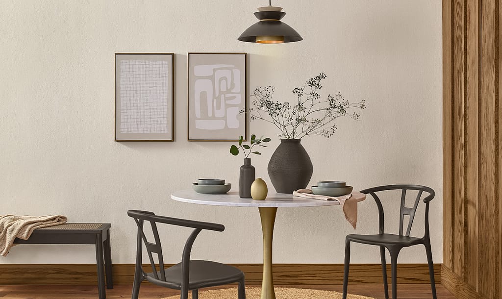
How to use Coffee Bean
- Refresh metal patio furniture.
- Update picture frames, lamps or decorative objects.
- Refinish a small side table or plant stand.
- Use it on hardware or shelving brackets.
- Pair it with green plants, natural fibers and cream-colored walls.
A small amount of dark brown can help visually ground a light room and connect newer pieces with vintage or wood furniture.
11. Minwax: Special Walnut
Minwax named Special Walnut its 2026 Color of the Year.
Special Walnut is a wood stain rather than a traditional wall color, but it fits perfectly with the larger 2026 movement toward natural materials, craftsmanship and warm brown tones.
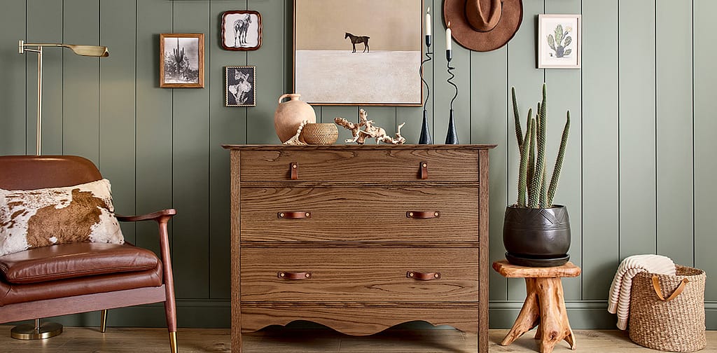
How to use Special Walnut
- Refinish a dining table, console or dresser.
- Add warmth to unfinished wood shelving.
- Use it on interior doors or a fireplace mantel.
- Refresh wood stairs, trim or built-ins.
- Combine it with creamy ivory, muted green, khaki or deep burgundy walls.
The final color of any stain depends heavily on the wood species, age and existing finish. Always test the stain on a hidden area or a sample of the same wood before beginning the full project.
Bonus: Pantone’s 2026 Color of the Year – Cloud Dancer
Pantone is not a paint manufacturer, but its annual selection influences interior design, fashion, packaging and home furnishings.
Pantone selected Cloud Dancer PANTONE 11-4201, a soft white intended to represent calm, clarity and creative reflection.
Cloud Dancer supports one of the most noticeable themes of 2026: using quieter neutral backgrounds to create space for richer materials, handcrafted pieces and deeply personal colors.
In the home, look for soft whites with gentle warmth rather than cold, blue-based whites. Use them with natural wood, linen, warm metals and one of the deeper 2026 paint colors.
What the 2026 Colors Have in Common
At first glance, Universal Khaki, Hidden Gem and Divine Damson may seem unrelated. Together, however, the 2026 selections reveal several clear decorating trends.
Warmth is replacing cool gray
Khaki, ivory, ochre, mahogany, walnut and espresso all point toward a warmer direction. Even the greens and blues have softened, smoky undertones rather than feeling sharp or icy.
Brown is becoming a major decorating color
Brown appears in Silhouette, Warm Mahogany, Coffee Bean and Special Walnut. It also influences the undertones of several other selections. Rich brown is increasingly being treated as a sophisticated neutral instead of simply a furniture or flooring color.
Nature is still an important influence
Eucalyptus, jade, walnut, stone, ochre and earthy red all connect interiors to the natural world. The difference in 2026 is that nature-inspired colors are becoming deeper, more complex and more luxurious.
Smaller rooms are becoming opportunities for color
Powder rooms, home offices, pantries, dining rooms and reading nooks are ideal places to try a dramatic shade. Rather than attempting to make every room appear large and bright, homeowners are using color to give smaller spaces a distinct atmosphere.
Personal style matters more than following one trend
The 2026 selections include light neutrals, saturated green, rich red, dark brown and multiple shades of blue. There is no single correct color. The strongest trend is creating a home that feels layered, comfortable and personal.
How to Choose the Right 2026 Color for Your Home
A beautiful color online may look completely different in your home. Before buying several gallons of paint, consider these steps.
Start with what cannot easily be changed
Look at your flooring, countertops, tile, fireplace stone and large furniture. The new paint should relate to these permanent elements rather than fight against them.
Pay attention to undertones
Two colors may both be described as beige while one has a pink undertone and another leans green or yellow. Place the sample near your trim and flooring to reveal these differences.
Test large samples
A small paper chip is rarely enough. Paint large sample boards or use removable peel-and-stick samples. Move them around the room and check the color in morning, afternoon and evening light.
Consider sheen
Flat and matte finishes conceal wall imperfections but are not always the easiest to clean. Eggshell or satin may be more practical in kitchens, bathrooms, hallways and children’s rooms. Semigloss is commonly used for trim, doors and cabinetry.
Begin with a smaller project
If you love a color but are nervous about using it throughout a room, begin with a door, vanity, island, bookcase or piece of furniture. Living with the color on a smaller surface can help you decide whether you want more.
Which 2026 Color Is Right for You?
Choose Universal Khaki if you want an adaptable whole-home neutral.
Choose Melodious Ivory if you prefer light, creamy and welcoming interiors.
Choose Hidden Gem if you want a rich, elegant green.
Choose Warm Eucalyptus if you prefer a softer and more restful green.
Choose Silhouette if you love tailored, dramatic rooms.
Choose Warm Mahogany if you want warmth with a heritage-inspired red-brown.
Choose Epernay if your style leans earthy, European or artisan-inspired.
Choose Divine Damson if you want a luxurious plum or burgundy statement.
Choose one of the Dulux blues if you want a room that feels calm, creative or deeply atmospheric.
Choose Coffee Bean or Special Walnut if you would rather introduce the 2026 trends through furniture, wood and smaller DIY projects.
Final Thoughts
The 2026 Paint Colors of the Year offer more freedom than a single decorating trend. They include practical neutrals for homeowners who want longevity, nature-inspired greens for restful rooms and dramatic reds, browns and blues for people ready to make a statement.
The best color is not necessarily the one receiving the most attention. It is the color that works with your home’s light, architecture and existing finishes while creating the feeling you want every time you enter the room.
Before committing, order samples, observe them throughout the day and give yourself permission to choose the color that feels right in your home. Trends can provide inspiration, but your home should ultimately reflect you.